|
|
Post by Sean on Aug 12, 2009 11:42:42 GMT -5
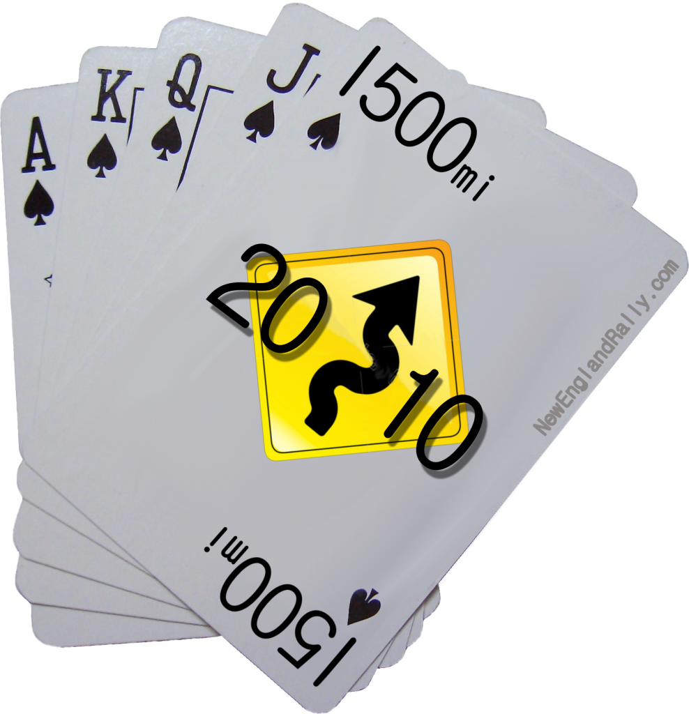
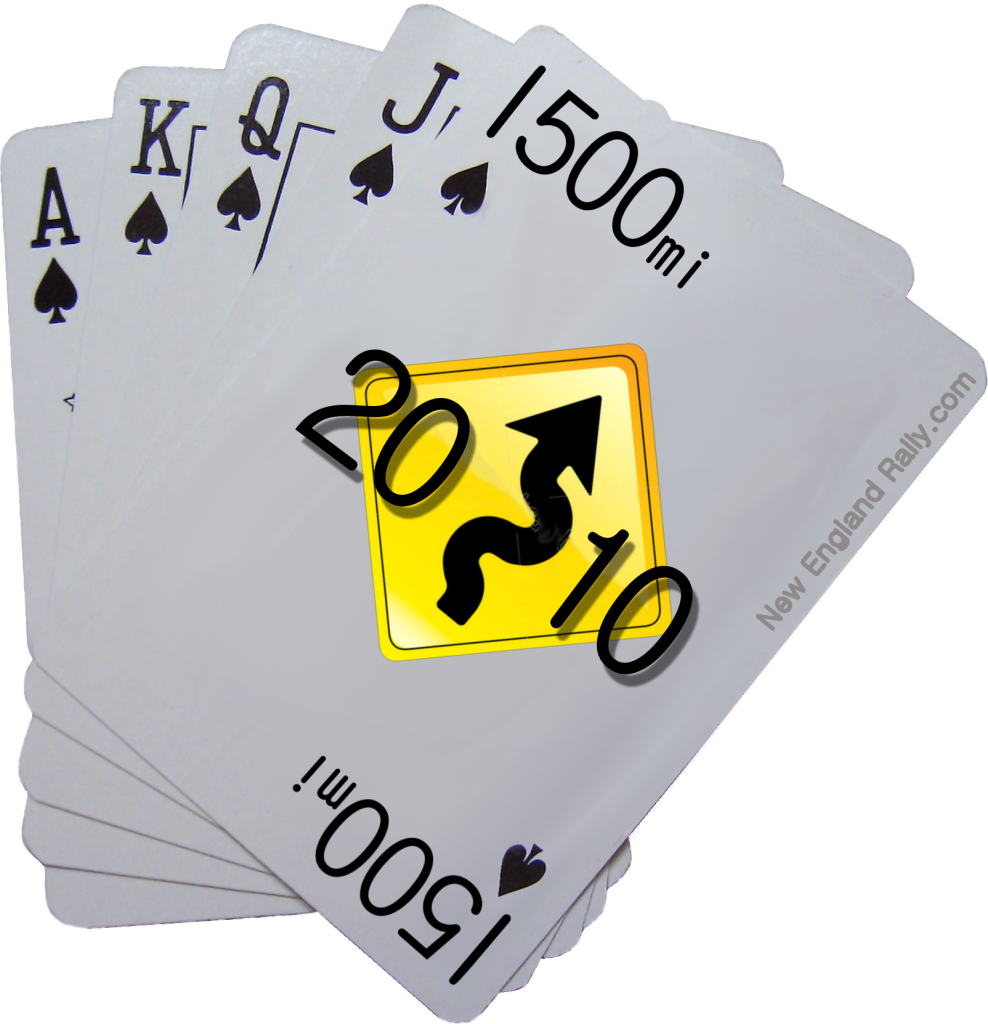
OK here is the task for anyone that wants to take on a mission.
I want to redo the banner at the top of the page.
It will also be used on the main page of the website.
It doesn't have to be a banner. It can be an oval or something else, but it MUST include the same images you see now.
You are welcome to try different looks for it, but I want the same thing. Winding road, 1500 mile road sign and New England Rally.
I don't mind adding cards or something to it, but THAT is the theme I want to use.
If you decide to take a shot please post the images in this thread.
Also try to do more than 1. Give me some choices. I find the more attempts that people make the better the designs become.
|
|
|
|
Post by ScrapinSTi on Aug 12, 2009 19:24:45 GMT -5
i'll dig up the ones i made in the spring early next week for you...
|
|
|
|
Post by kalitarios on Jun 1, 2010 7:19:25 GMT -5
can you post the elements of the logo now? namely, the cards
|
|
|
|
Post by Sean on Jun 1, 2010 7:23:23 GMT -5
I'll create a new road that looks smoother this week.   |
|
|
|
Post by ScrapinSTi on Jun 1, 2010 7:38:34 GMT -5
I never did this, did i? lol
|
|
|
|
Post by Sean on Jun 1, 2010 7:40:22 GMT -5
Slacker!
|
|
|
|
Post by kalitarios on Jul 1, 2010 4:24:46 GMT -5
|
|
|
|
Post by kalitarios on Jul 1, 2010 4:26:01 GMT -5
Any way to get that for a logo for my hood  |
|
|
|
Post by ScrapinSTi on Jul 1, 2010 7:55:36 GMT -5
Thats an AWESOME logo!
|
|
|
|
Post by Sean on Jul 1, 2010 8:08:36 GMT -5
That is really cool.
I'll talk to the guy that I get my stickers from and see what he would charge me to print some of those.
|
|
|
|
Post by dmx21 on Jul 1, 2010 10:35:21 GMT -5
Is there any way to get the kerning (spacing between the individual letters) a little more consistant on the "NewEnglandRally.com" part? New is kinda squished, and Rally is all spread out. Other than that, pretty cool.
|
|
|
|
Post by kalitarios on Jul 1, 2010 12:12:10 GMT -5
 Made some quick changes to the lighting (sheen at the top of the cards) and tried to fix the lettering. Anything else I should try? |
|
|
|
Post by kalitarios on Jul 1, 2010 13:04:40 GMT -5
A quick shot at a top banner: 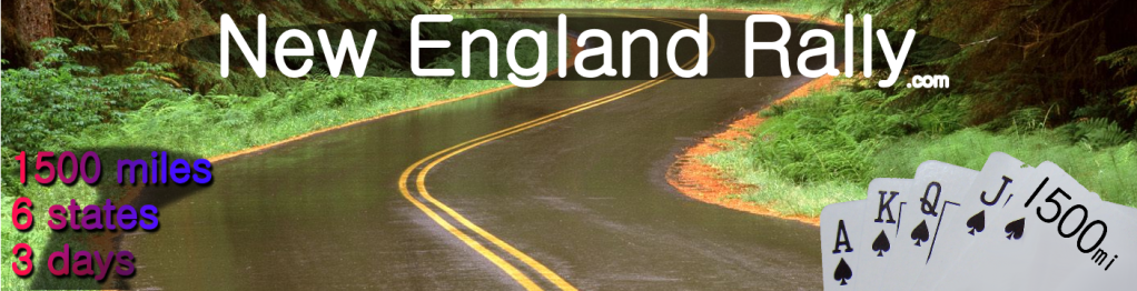 I'll have to redo the lighting in the corner I guess. It looked brighter on my monitor for some reason. |
|
|
|
Post by Sean on Jul 1, 2010 16:40:48 GMT -5
I actually like that one a lot.
I like the one that I have up now so any variations of that is most likely the best.
|
|
|
|
Post by rxmclaren7 on Jul 1, 2010 17:47:53 GMT -5
looks good!!
|
|
|
|
Post by skimobile on Jul 1, 2010 18:40:50 GMT -5
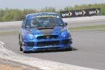
I'm liking the new stuff...just hard to get Sean out of the 80's era gaphics : ) ...also, unless I'm mistaken, that road pic on your Logo isn't in New England is it? Looks like T.O.D. The road up through Smuggler's Notch is just as turny and that road is actually in New ENgland : P 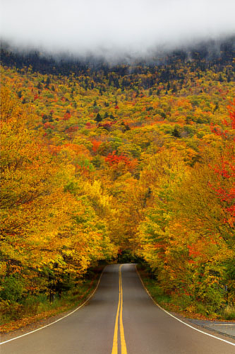    Just a thought |
|
|
|
Post by Sean on Jul 1, 2010 19:31:15 GMT -5
The site is being rebuilt as we speak (type?)
It will launch sometime after the run in August.
The logo as well as a LOT (everything) will change.
I really like that Smugs picture Sean. Got any more that are twisty?
I have the perfect picture in my mind, but it's up on Bear notch road. I'll most likely get it some time shortly after the run.
|
|
|
|
Post by skimobile on Jul 1, 2010 22:19:15 GMT -5
Mt. Washington? 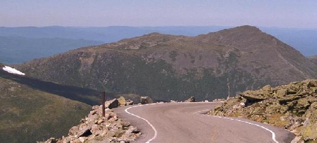 |
|
|
|
Post by Sean on Jul 1, 2010 23:13:26 GMT -5
Nah, I like the one that is up there now.
|
|
|
|
Post by ScrapinSTi on Jul 2, 2010 9:19:09 GMT -5
Yeah Sean... Time to get out of the 80's...  |
|
|
|
Post by cegan09 on Jul 7, 2010 11:29:13 GMT -5
Not to be negative, but you might consider a banner that doesn't include a photo. The photo overlayed with multicolored text and then what appears to be a decently legit logo (the cards), just screams 90's geocities style to me. I'm glad there is an overhaul coming, to be honest i didn't think the site was serious the first time i saw it. Granted this is all my opinion, so do with it what you wish.
It's still miserable outside, maybe i'll try and scrape a few ounces of creativity together and see if i can come up with anything. design isn't really my forte though.
|
|